1. Introduction: The Art and Science of Shirt Logo Placement
Logo placement on shirts is more than just a technical step—it’s a blend of art and science that shapes how your brand is seen, remembered, and worn. The right logo spot can turn a simple shirt into a walking billboard, broadcasting professionalism and style with every glance. Whether you’re an embroiderer, designer, or business owner, mastering placement means your work stands out for all the right reasons.
In this guide, you’ll discover the industry’s standard logo positions, learn sizing and measurement best practices, and explore strategies tailored to shirt types and occasions. We’ll also tackle design considerations that keep your logos crisp and your branding sharp. Ready to place your mark with confidence? Let’s dive in and unlock the secrets to perfect shirt logo placement.
Table of Contents
- 1. Introduction: The Art and Science of Shirt Logo Placement
- 2. Standard Logo Placement Locations: Industry-Proven Positions
- 3. Logo Sizing and Measurement Guidelines for Balanced Design
- 4. Context-Driven Placement: Shirt Types, Occasions & Printing Methods
- 5. Left Chest vs. Center Chest: Choosing the Right Placement
- 6. Design Mastery: Avoiding Common Logo Placement Pitfalls
- 7. Special Scenario Solutions: Oversized Shirts, Polos, and Layered Designs
- 8. Conclusion: Strategic Placement as a Branding Superpower
- 9. FAQ: Logo Placement Essentials Answered
2. Standard Logo Placement Locations: Industry-Proven Positions
When it comes to shirt branding, certain logo placements have stood the test of time for good reason—they balance visibility, professionalism, and aesthetic appeal. Let’s break down the most popular locations and the nuances that make each one shine.
2.1 Left Chest: The Subtle Powerhouse for Professional Branding
The left chest placement is the gold standard for corporate uniforms, team apparel, and minimalist branding. Think of it as the “handshake” of shirt design—subtle, approachable, and instantly professional.
Optimal Positioning and Sizing:
- Position: 3–4 inches below the collar, centered between the shoulder seam and armpit.
- Size: 2.5–5 inches in width or height for adult shirts.
This location keeps your logo visible without overwhelming the shirt. For polos, align the design with the left shoulder seam and button placket for a polished look. Women’s shirts often benefit from placing the logo about 1 inch higher than on men’s shirts, ensuring a balanced appearance across different body types.
Use Cases:
- Corporate uniforms
- Staff shirts for events
- Subtle, everyday branding
Tips for Success:
- Keep designs simple—detailed logos can lose clarity at this scale.
- Pair with a full back print for layered branding impact.
2.2 Center Chest: High-Impact Visibility for Bold Statements
If you want your logo to command attention, the center chest is your stage. This placement is ideal for promotional wear, event merchandise, or any scenario where your brand should be front and center.
Guidelines:
- Position: 2–5 inches below the collar, perfectly centered.
- Size: 6–10 inches wide/tall for adult shirts.
The center chest offers eye-level visibility and works well for moderate detail or text-heavy designs. But beware the “belly logo” effect—placing the design too low (below 5 inches from the collar) can make it look awkward. Always ensure the logo sits high enough to stay in the viewer’s line of sight and doesn’t overlap shoulder seams.
Use Cases:
- Promotional giveaways
- Event staff shirts
- Statement branding
Pro Tip: For smaller shirt sizes, scale down the design to maintain balance and avoid crowding the garment.
2.3 Sleeve, Back, and Full-Front: Strategic Secondary Placements
Sometimes, your branding needs to go beyond the chest. Strategic secondary placements—on sleeves, the back, or spanning the full front—offer creative ways to layer your message or maximize impact.
Sleeve Placement:
- Position: 7.5–9 inches from the shoulder seam; for polos/jackets, 4–6 inches from the center.
- Best For: Team logos, sponsor branding, secondary graphics.
- Adjustment: Increase placement distance by about 0.5 inches per shirt size for consistent results.
Back Placement:
- Position: 5–9 inches below the collar, centered between shoulder seams.
- Best For: Maximum impact on jackets, hoodies, or structured garments. Use larger, bolder logos to stand out against thicker fabrics.
Full-Front Placement:
- Position: Spans the entire chest, starting 3–5 inches below the collar.
- Size: 8–10 inches or more, depending on shirt size.
- Best For: Intricate artwork, bold branding, or when you want your design to be the main event.
When to Use These Placements:
- Layered branding (e.g., left chest + full back)
- Sports teams or event apparel requiring multi needle embroidery machine capabilities
- Designs requiring extra space or visibility
Best Practices:
- Avoid overlapping zippers, seams, or pockets.
- Use placement templates or T-squares for symmetry.
- For layered designs, maintain a visual hierarchy—let one logo lead, with others as supporting elements.
3. Logo Sizing and Measurement Guidelines for Balanced Design
Getting logo placement right isn’t just about location—it’s about scale, proportion, and consistency across every shirt. Here’s how to ensure your designs look sharp and professional, no matter the garment.
3.1 Placement-Specific Dimensions: From Pocket to Oversized Prints
Different placements call for different dimensions. Use these guidelines to keep your logos balanced and visually appealing:
| Placement | Width (inches) | Height (inches) | Distance from Collar | Typical Use Case |
|---|---|---|---|---|
| Center Chest | 6–12 | 6–8 | 2.5–4 | Bold branding, events |
| Left Chest | 2.5–5 | 2.5–5 | 3 | Professional uniforms |
| Upper Back | ~12 | ~5 | 4 | Secondary logos/slogans |
| Neck Collar | 1–3 | 1–3 | 1 | Subtle details, event dates |
| Full Front | 10–14 | 10–14 | 3–4 | Statement designs |
| Sleeve | 3–4 | 3–4 | Varies | Team/sponsor branding |
| ~3 | ~3 | Align with pocket | Pocket-specific logos |
Proportional Scaling:
- Adults: 3.5–4.5 inches for left chest logos.
- Youth: 2–3 inches for smaller frames.
- For oversized or full-front prints, start 2–3 inches below the collar and extend as needed, staying within the garment’s printable area.
Pocket and Collar Tips:
- Pocket logos should fit within the pocket area—typically around 3 x 3 inches.
- Collar or upper-back logos are best kept between 1–3 inches for subtle, refined branding.
3.2 Anchor Points and Alignment Techniques for Consistency
Consistency is king—especially when producing uniforms or bulk orders. Here’s how to keep every logo perfectly placed:
Anchor Points:
- Use the intersection of the shoulder seam (vertical axis) and armpit line (horizontal axis) as your reference for left chest placement.
- For center chest and full-front designs, align with the midpoint of the collar and the vertical center of the shirt.
Alignment Tools:
- T-squares, rulers, and placement templates help ensure symmetry across multiple garments.
- The “finger method” (placing fingers below the collar) is a quick, tool-free way to estimate placement in a pinch.
Scaling for Different Sizes:
- Increase placement distance by 0.5 inches for each size up (e.g., small: 3.5', medium: 4', large: 4.5').
- For youth shirts, scale down both logo size and placement distance to maintain proportion.
Uniformity Across Orders:
- Keep detailed records in digitizing embroidery software for measurement consistency and placements for future reference.
- Test designs on mockups or physical samples before full production to ensure alignment and readability.
Combination Strategies:
- Pair sleeve prints with front or back logos for layered branding.
- Use upper back placements for secondary messaging when the front is already occupied.
By following these guidelines, you’ll achieve a harmonious balance between logo size, placement, and shirt style—ensuring your branding always looks intentional and professional.
4. Context-Driven Placement: Shirt Types, Occasions & Printing Methods
Perfect logo placement isn’t just about measurements—it’s about context. The type of shirt, the event, and even your chosen printing method all influence where your logo should land for maximum brand impact and visual appeal. Let’s break down the essentials.
4.1 Garment-Specific Rules: T-Shirts, Polos, Hoodies, and Beyond
Every garment tells a different story, and your logo placement should complement that narrative. Here’s how to tailor your approach for the most common shirt types:
| Shirt Type | Optimal Placement | Design Size | Key Considerations |
|---|---|---|---|
| T-Shirts | Center chest (2–3' below collar) | 6–10' width | Avoid “belly logo” effect; align with collar for symmetry. |
| Polo Shirts | Left chest (3–4' below shoulder) | 2.5–5' width | Subtle branding; align between neckline and armpit seam. |
| Hoodies/Sweaters | Back or sleeve | Full-back: 12–18' high | Larger designs on back; sleeves for small logos. |
| Tank Tops | Center chest (smaller scale) | 6–8' width | Adjust for narrower torso; avoid shoulder overlap. |
Material Matters: Thicker fabrics like fleece or heavy cotton may need larger, bolder designs for clarity, while lightweight blends suit smaller, detailed prints. Embroidery thrives on structured polos and thicker knits, while DTG (direct-to-garment) printing shines on smooth, cotton-rich tees.
Pro Tips from the Pros:
- For T-shirts, keep center chest logos high enough (2–3' below collar) to avoid the dreaded “belly logo.”
- On polos, align your left chest logo with the shoulder seam and button placket for a crisp, professional look.
- Hoodies love big, bold back prints—just be mindful of hoods that might cover your design.
From the Workshop: The “finger method” is a handy way to eyeball placement—three fingers below the collar for center chest, or use a ruler for precision. Always lay garments flat and smooth out wrinkles before marking your anchor points.
4.2 Occasion-Based Strategies: Corporate, Promotional, and Casual Wear
The event sets the tone for your logo’s role. Consider these placement strategies based on the occasion:
| Occasion | Recommended Placement | Design Style | Example Use Cases |
|---|---|---|---|
| Corporate events | Left chest or sleeve | Minimalist logos/text | Employee uniforms, team branding |
| Promotional events | Full front or back | Bold graphics/text | Concert merch, event branding |
| Casual wear | Center chest or sleeve | Playful/creative designs | Retail apparel, lifestyle branding |
| Luxury branding | Left chest or collar back | Embroidered/subtle prints | High-end fashion, boutique uniforms |
Audience Alignment:
- Youth-oriented brands often opt for vibrant back prints or oversized front logos.
- For professionals, understated left chest placements signal reliability and tradition.
- Luxury apparel favors subtle embroidery on the collar or upper back.
Layering for Impact: Pair a left chest logo with a full-back print for layered branding—your mark is visible whether the shirt is buttoned up or dressed down.
Testing Protocols: Always create sample shirts to see how placements look in real life. Adjust for body type—longer torsos may need slightly lower center chest designs.
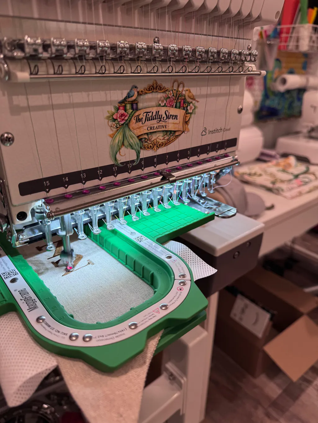
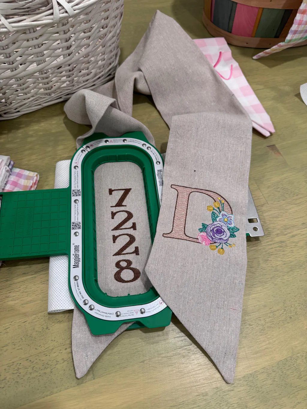
4.3 Optimizing Embroidery Efficiency with Magnetic Hoop Systems
Let’s talk shop: achieving precise, consistent logo placement—especially for embroidery—can be a challenge. That’s where magnetic hoop systems like MaggieFrame magnetic hoops embroidery step in, revolutionizing the process for garment embroidery.
Why Magnetic Hoops Matter: Traditional screw-tightened hoops are time-consuming and can cause uneven tension, leading to misaligned logos or dreaded hoop marks. MaggieFrame magnetic embroidery hoops change the game:
- Speed: Hooping time is slashed by up to 90% compared to traditional methods. What once took three minutes now takes just thirty seconds.
- Precision: Built-in guiding lines and a powerful magnetic clamping system ensure your logo lands exactly where you want it, every time.
- Consistency: Whether you’re working with delicate silks or thick sweatshirts, MaggieFrame’s even tension prevents puckering and keeps every logo crisp.
- Fabric Protection: The magnetic force distributes pressure evenly, reducing the risk of hoop burn—a must for high-end or delicate garments.
Real-World Results: Batch production becomes a breeze. Operators save hours, reduce misalignment errors, and enjoy a more comfortable workflow. For embroidery businesses, this means faster turnaround, fewer wasted garments, and happier clients.
Compatibility: MaggieFrame offers over 17 hoop sizes and fits hundreds of commercial embroidery machines—making it a versatile solution for any shop.
Bottom Line: If you want your shirt logos to look sharp, stay consistent across orders, and keep your workflow humming, consider making MaggieFrame magnetic hoops your new embroidery partner.
5. Left Chest vs. Center Chest: Choosing the Right Placement
When it comes to shirt branding, the left chest and center chest placements are the heavyweights. But which one should you choose? Let’s break down the pros, cons, and best-use scenarios for each—so you can make the right call for your brand or event.
5.1 Corporate Uniforms vs. Event Merch: A Comparative Analysis
| Placement | Size | Position | Best For |
|---|---|---|---|
| Left Chest | 3–5' wide, 2–3' tall | 3–4' below collar, aligned with seam | Corporate uniforms, subtle branding |
| Center Chest | 6–10' wide, 6–8' tall | 2–4' below collar, centered | Events, bold graphics, promotions |
Corporate Uniforms: The Case for Left Chest
Pros:
- Professional and understated—think Polo Ralph Lauren or Lacoste.
- Balanced visibility: sits 3–4' below the collar for a classic, uniform look.
- Consistent sizing (3–5' wide) keeps branding cohesive across your team.
Cons:
- Can be obscured by jackets or open shirts.
- Requires gender-specific adjustments; women’s logos often sit 1' higher for balance.
Event Merch: The Case for Center Chest
Pros:
- High visibility—remains prominent even under outerwear.
- Bold branding: ideal for logos that need to shout, not whisper.
- Perfect for sponsor logos and event statements.
Cons:
- Large designs (6–10' wide) may overpower formal attire.
- Watch out for the “belly logo” effect—keep it high enough for eye-level impact.
Production & Cost Considerations
- Left Chest: Smaller, more cost-effective prints; ideal for bulk uniform orders using industrial embroidery machines.
- Center Chest: Larger prints mean higher costs but deliver maximum brand exposure—great for one-off events or promotional campaigns.
Contextual Recommendations
| Context | Recommended Placement | Rationale |
|---|---|---|
| Corporate Uniforms | Left Chest | Subtle, professional, and universally accepted |
| Promotional Events | Center Chest | Bold, visible, and sponsor-friendly |
Pro Tip: Test your designs with mockup tools before production to visualize placement and ensure your logo stands out just right.
6. Design Mastery: Avoiding Common Logo Placement Pitfalls
A perfectly placed logo can still fall flat if the design itself isn’t optimized for the garment. Let’s dive into the most common pitfalls—and how to dodge them with confidence.
6.1 Color Contrast, Simplicity, and Seam/Pocket Compatibility
Keep It Simple:
- Left chest placements work best for simple logos—too much detail gets lost in the small space.
- Center chest and full-front designs can handle moderate detail, but avoid clutter.
Maximize Readability:
- High-contrast colors (think black on white, or white on navy) make your logo pop—especially on left chest and sleeve placements.
- For text, keep it above the chest curve and use clean, legible fonts.
Mind the Shirt Features:
- Pockets: Align left chest logos with pocket dimensions; don’t let your design spill over seams or get swallowed by the pocket.
- Seams: Upper back designs should sit just below the collar, “cheated” toward the top for balance.
- Sleeves: Place logos 1–3' above the hem to avoid distortion when arms move.
| Error | Solution |
|---|---|
| Center chest too low | Place 2–3' below collar to avoid “belly logo.” |
| Oversized left chest logos | Keep to 3–5' wide for balance. |
| Centered upper back designs | Move higher for proportional alignment. |
| Sleeve prints too low | Start 1–3' above hem for consistent results. |
Proportional Sizing:
- Scale logos for different shirt sizes—men’s polos: 3.5' (S), 4' (M), 4.5' (L).
- Women’s left chest logos often sit 1' higher for aesthetic alignment.
Trends to Watch:
- Sleeve branding is on the rise for modern, understated flair.
- Multi-placement designs (left chest + full back) offer layered brand impact.
6.2 Tension Control in Embroidered Logos: Preventing Hoop Burn
Embroidery is an art—but it’s also a science. One of the biggest pitfalls? Hoop burn—those unsightly marks left behind by traditional hoops, especially on delicate fabrics.
How MaggieFrame Magnetic Hoops Help:
- Even Pressure: MaggieFrame’s magnetic system distributes force smoothly across the fabric, eliminating the sharp pressure points that cause hoop burn.
- Fabric Care: Whether you’re working with silks, knits, or thick sweatshirts, the magnetic grip holds fabric securely without crushing fibers.
- Placement Precision: Built-in reference lines make it easy to align your logo perfectly, every time—no more guesswork, no more wasted shirts.
The Result: Your embroidered logos stay crisp, your garments stay pristine, and your clients stay happy.
Bottom Line: If you want flawless, professional embroidery—without the risk of hoop burn or misaligned designs—embroidery machine hoops from MaggieFrame are a smart investment for any serious embroiderer.
---
Ready to level up your logo placement game? Keep reading for special scenario solutions and advanced tips in the next section!
7. Special Scenario Solutions: Oversized Shirts, Polos, and Layered Designs
When it comes to logo placement, not every shirt fits the 'standard' mold. Oversized tees, polos with pockets, and layered front-and-back designs all bring unique challenges—and opportunities—for creative, balanced branding. Let's break down the expert strategies that keep your logos looking sharp, no matter the garment or complexity.
7.1 Niche Applications and Combination Placements
#### Oversized Shirts: Go Big, But Stay Balanced
Oversized shirts are the perfect canvas for bold, full-front or oversize designs. But there's a fine line between eye-catching and overwhelming. Here's how to nail it:
- Full-Front Placement: For oversized tees, use designs 10–12 inches wide, starting 3 inches below the collar. This keeps the logo in the viewer's line of sight and prevents it from being swallowed by fabric folds.
- Oversize Front Placement: Want to make a statement? Go up to 12–15 inches wide, but keep the top edge 2–3 inches below the collar for maximum impact. Always align the design with the shirt's seams to avoid distortion—nothing ruins a bold print faster than a warped logo.
- Avoid Clutter: Large doesn't mean busy. Stick to clean, bold graphics that scale well. Too much detail can get lost or look messy on oversized surfaces.
#### Polo Shirts: Professional, Polished, and Pocket-Smart
Polos are the go-to for corporate and team uniforms, but their unique features—like plackets and pockets—demand extra attention:
| Placement | Size | Positioning |
|---|---|---|
| Left Chest | 3–4 inches wide | 3–4 inches below the neckline, aligned with the shoulder seam |
| Right Chest | 2.5–4 inches wide | Mirrors left chest for balance |
| Sleeve | 2–3 inches wide | Centered on the sleeve, avoiding seams |
| Back | 6–10 inches wide | Centered, 3–4 inches below the collar |
- Left Chest: The classic. Align with hat hoops for embroidery machines on shoulder seam and keep it above the pocket for a crisp, professional look.
- Sleeve Logos: Small and secondary, perfect for subtle branding or team insignias.
- Back Logos: Go larger here, but make sure they complement—not compete with—the front design. Event names or slogans work well.
Pro Tip: If your polo has a pocket, ensure the logo fits above or within the pocket area (typically around 3 x 3 inches). Never let your design spill over seams or get lost in the pocket fold.
#### Layered Designs: Front Meets Back
Pairing a front logo with a back print is a classic move—but balance is everything:
- Primary Branding: Use the left chest (3–4 inches wide) for logos that need to be seen during face-to-face interactions.
- Secondary Branding: Place back logos (6–10 inches wide) centered and 3–4 inches below the collar for visibility from behind.
- Keep It Clean: Limit yourself to one front and one back logo. Too many elements can make the shirt feel cluttered and confuse the brand message.
#### General Best Practices for Special Scenarios
| Placement | Width | Height | Space from Collar |
|---|---|---|---|
| Center Chest | 6–12 inches | 6–8 inches | 2.5–3 inches |
| Left Chest | 2.5–5 inches | 2.5–5 inches | 3 inches |
| Full Back | 10–14 inches | 6–15 inches | 3–4 inches |
- Logo Complexity: Intricate designs need larger spaces for clarity—keep it simple for small placements.
- Shirt Size: Scale logos proportionally; youth shirts require smaller designs and closer placement to the collar.
- Seam-to-Seam Prints: For wraparound effects, ensure the design flows with the shirt's seams to prevent distortion.
#### Specialized Placement Scenarios
- Pocket Designs: Align logos with the pocket's dimensions, typically left chest.
- Wraparound Designs: Use seam-to-seam printing for continuous patterns, but steer clear of collars and seams that could disrupt the artwork.
- Diagonal Designs: Placing logos at a 45-degree angle can add dynamic energy, but test with mockups to ensure it reads well on the body.
Pro Insight: Use the 'finger method' or a ruler for quick, accurate placement—three fingers below the collar for center chest, or 3–4 inches for left chest. Always lay garments flat and smooth out wrinkles before marking anchor points.
Final Thought: No matter the scenario, the secret to standout branding is balance—between size, placement, and design hierarchy. Test your layouts on real shirts before full production, and don't be afraid to get creative with combinations, as long as each element has room to shine.
8. Conclusion: Strategic Placement as a Branding Superpower
Mastering logo placement is more than a technical skill—it’s a branding superpower. By matching your logo’s position to the shirt style and purpose, prioritizing proportionality, and rigorously testing your designs, you ensure every shirt becomes a billboard for your brand. Remember: balance, clarity, and context are your best allies. Apply these expert guidelines, and watch your logo command attention, spark recognition, and elevate your apparel to new heights.
9. FAQ: Logo Placement Essentials Answered
9.1 Q: Where should a logo sit on a shirt?
A: For most shirts, the left chest is the industry standard—typically 3–4 inches below the collar and centered between the shoulder seam and armpit. Center chest placements are great for bold statements, sitting 2–5 inches below the collar.
9.2 Q: What side of the shirt does the logo go on?
A: The logo usually goes on the left chest (the wearer’s left). This placement is classic, professional, and highly visible during interactions.
9.3 Q: How many inches down should a logo be placed?
A: Standard placements are 3–4 inches below the collar for left chest logos, and 2–5 inches below the collar for center chest designs. Oversized or full-front prints may start 2–3 inches down for maximum impact.
9.4 Q: What are the rules for pocket logo placement?
A: Pocket logos should fit within the pocket area—typically around 3 x 3 inches—and align with the pocket’s dimensions. Avoid letting the design spill over seams or get lost in the pocket fold.
9.5 Q: How should logo sizing be adjusted for youth shirts?
A: Scale down both the logo size and placement distance for youth shirts. For left chest, use 2–3 inches wide and place the logo slightly closer to the collar than on adult sizes to maintain proportion.
Ready to put these insights into action? Grab your favorite tee, test out your placements, and let your logo do the talking!